Project type
Individual capstone project @BrainStation
Project length
- 10 weeks
My role
- UX/UI Designer
- UX Researcher
- Brand Designer
Software
Figma
InVision
Illustrator
What is Beam?
Target audience
Beam is a social media platform for professional development that targets secondary education students, recent grads, and people who want to improve themselves while making a transition to a career. Beam also provides tools for content creators who love to share their knowledge, expand their network, and earn money mentoring.
Main features
Users can upload educational and insightful videos about career, courses, resume building, and market insights. The app comes with a video scheduling feature for networking and mentorship.
Interact
with experienced content creators to learn about a career, courses, and market insights.

Explore
insightful and educational videos shared by community members.

Organize
Your videos based on topics and answer community questions.

Schedule
video meetings with mentors to learn.


How does Beam help young adults?
Seeking employment with no experience or connections is hard. Moreover, it’s easy to make avoidable mistakes during the application & interview process. The goal of this project is to overcome some of these challenges.

Are young adults taking advantage of LinkedIn?
Gen Z college students who are well-educated but lack practical experiences are discouraged to use professional networking platforms such as LinkedIn to seek employment and connections. Over 50% of young adults in the US age 19-24 have a LinkedIn account, yet 96% of this group rarely or never uses it. On the other hand, 77% of recruiters rely on LinkedIn.
“LinkedIn’s challenge is that its product is most useful once you already have a job. Or at least know a bunch of other people who do. Oftentimes, college students have neither, which makes the idea of creating a profile seem overwhelming.”
- Ada Yu – Product Manager at LinkedIn
Concerning insights
1 in 5 students in thee Ontario college and university system are graduating with literacy and numeracy levels that don’t meet what the OECD (Organization for Economic Co-operation and Development) regards as basic standards.
54% of recent graduates find it difficult to transition from college to the workplace.

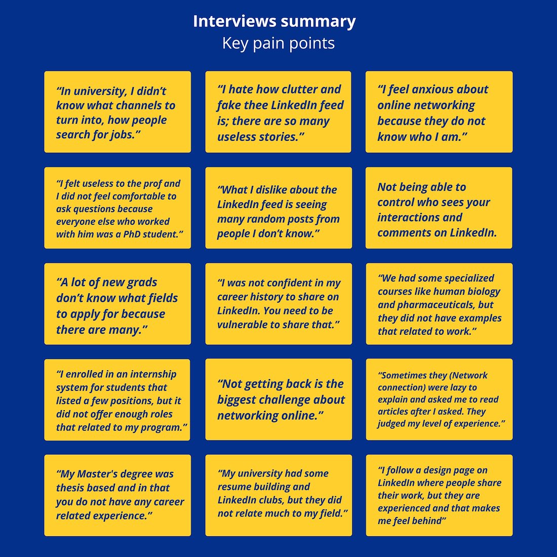
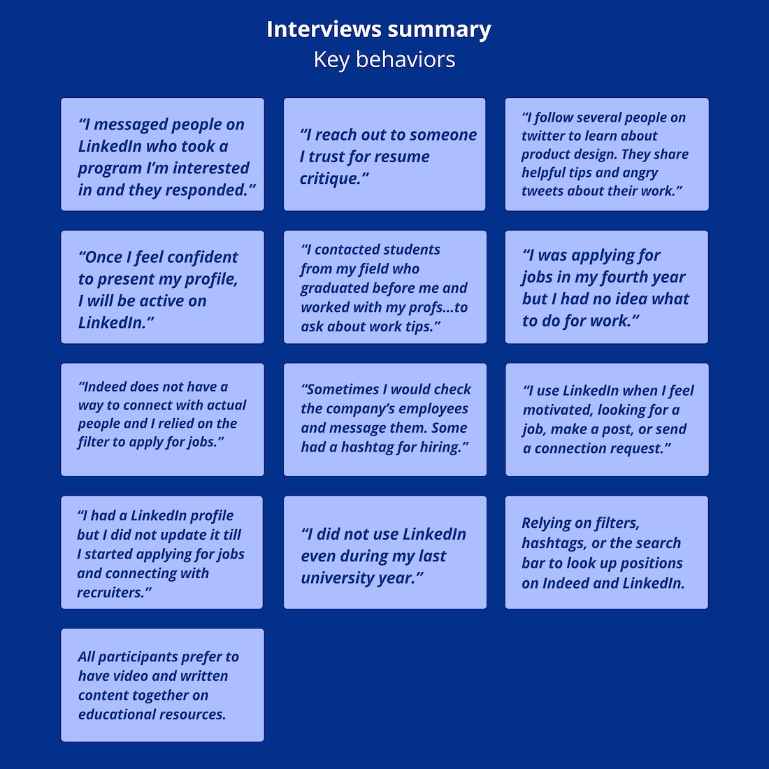
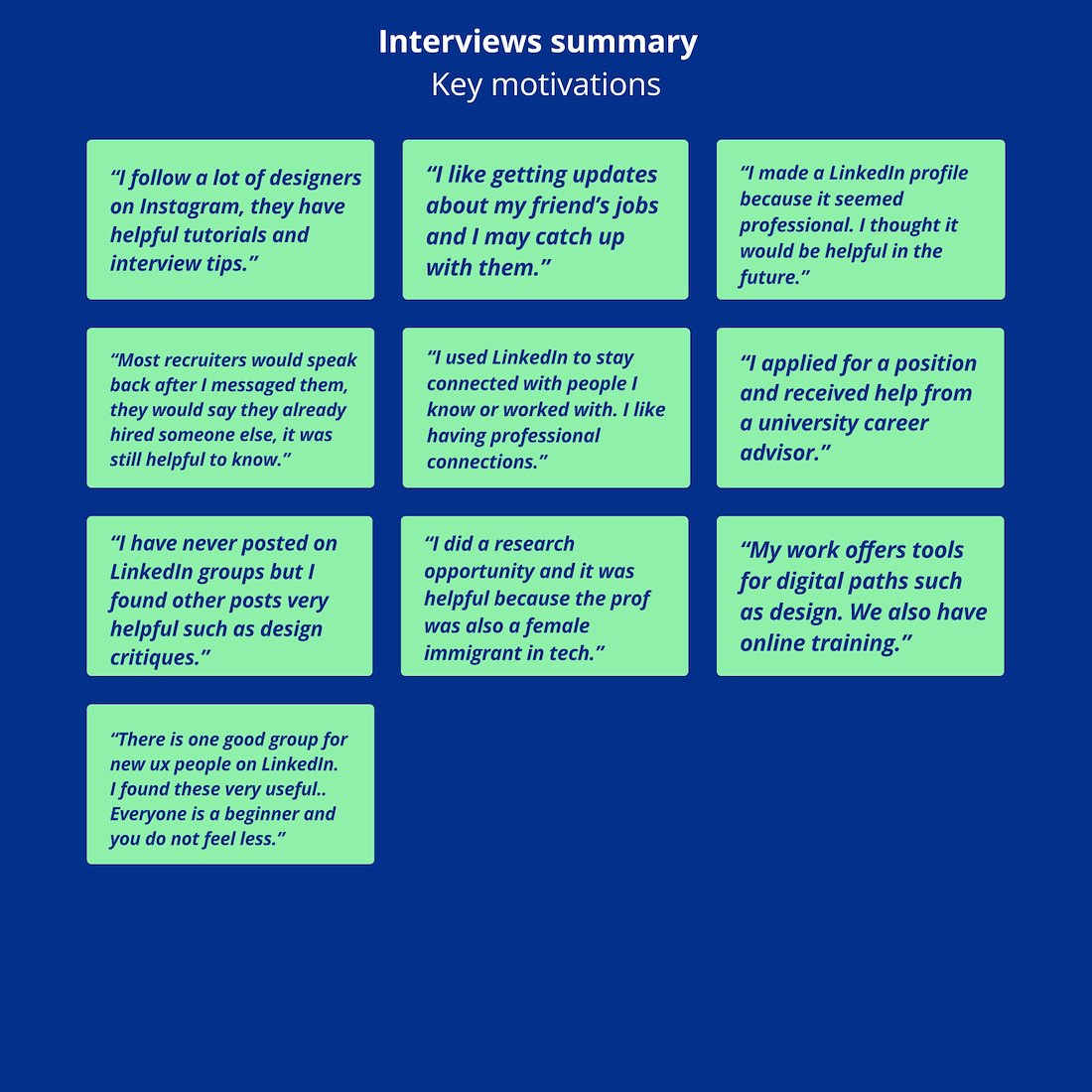
Conducting interviews
I conducted semi-structured phone interviews (25-30 minutes) with three Canadian participants who graduated from Canadian universities.
Participant criteria:
• Age: 20-27
• Resident of Canada
• Completed at least two years of university

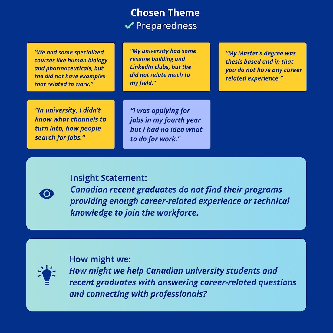
Choosing a theme
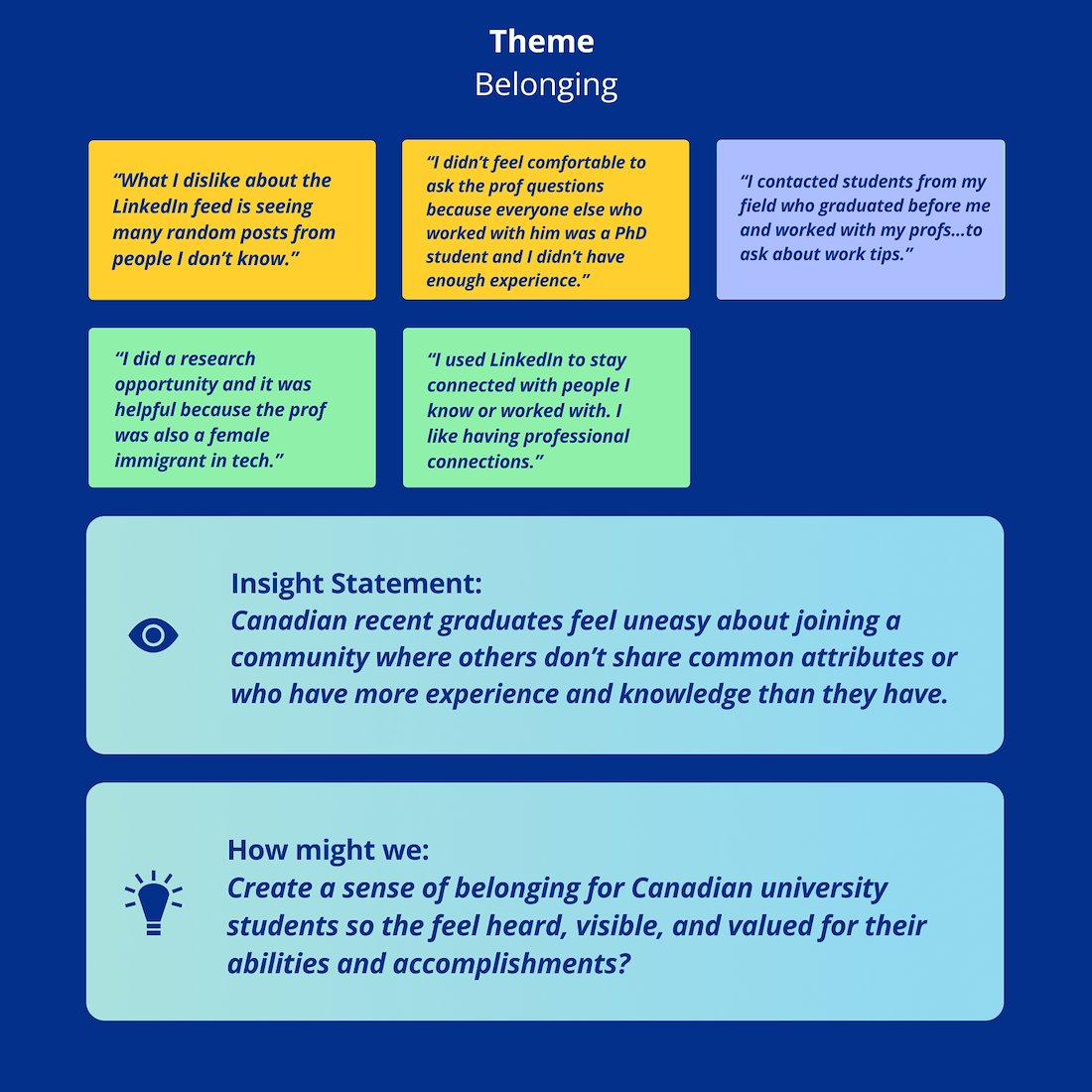
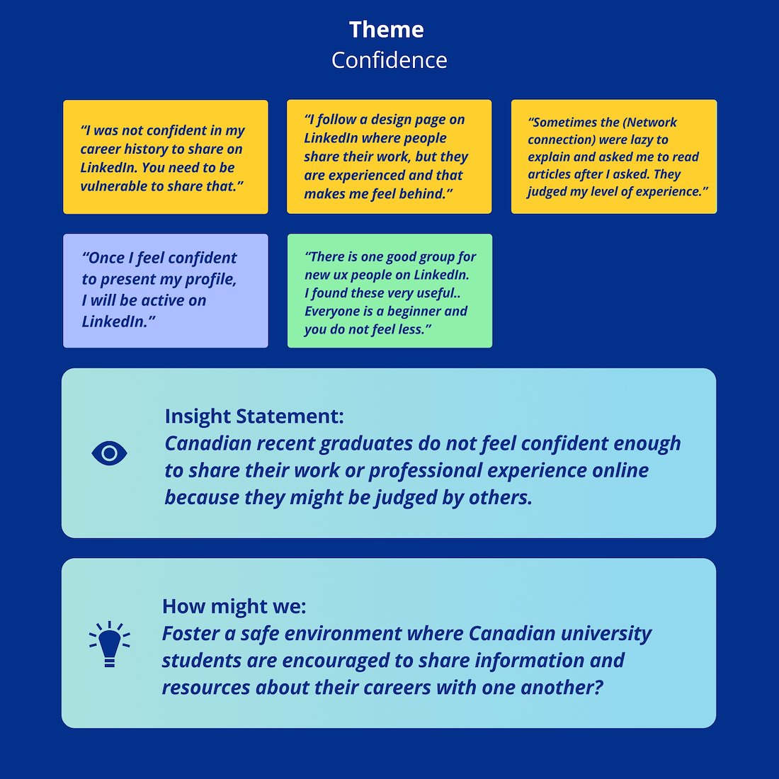
I selected a sample of similar pain points, behaviors and motivations to be put under one theme. Based on findings from interviews and research, preparedness proved to be the best theme to concentrate on. It is also more quantifiable than the other two themes.
Putting myself in their shoes
I combined the data from the secondary research, interview findings, and my own personal experience as a graduate student who went through these challenges to build a persona and an experience map.

Applying to jobs is stressful
There is an opportunity to provide more support to students and new graduates. To solve these problems, I started by creating user stories. Only one of these user stories was chosen as the primary core feature after they were all grouped into related themes.


Inspirations from other apps
I began looking up inspirations from competitors and relevant apps. I downloaded these apps and focused on a few features that I wanted to incorporate in my app.

Early ideas

Round 1: Usability testing and analysis
In order to better understand how users engage with my app and get their input, I recruited five people to test my initial prototype.

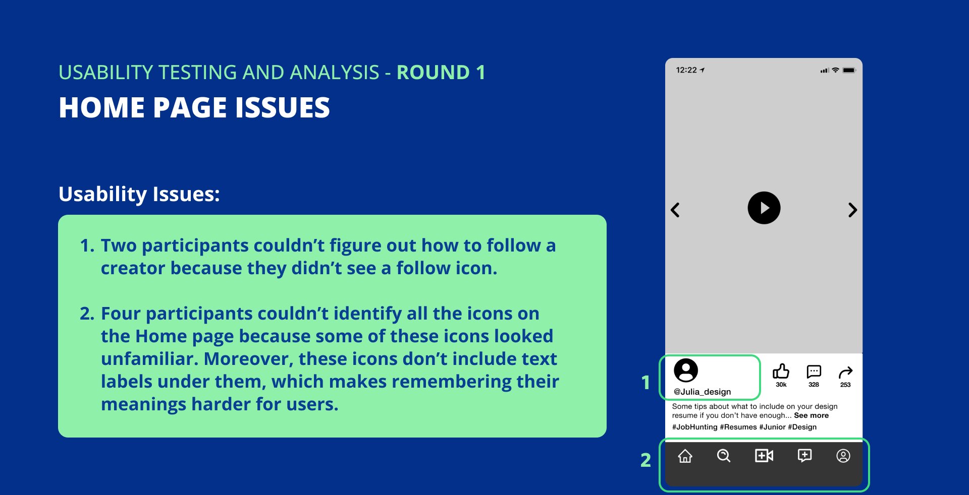
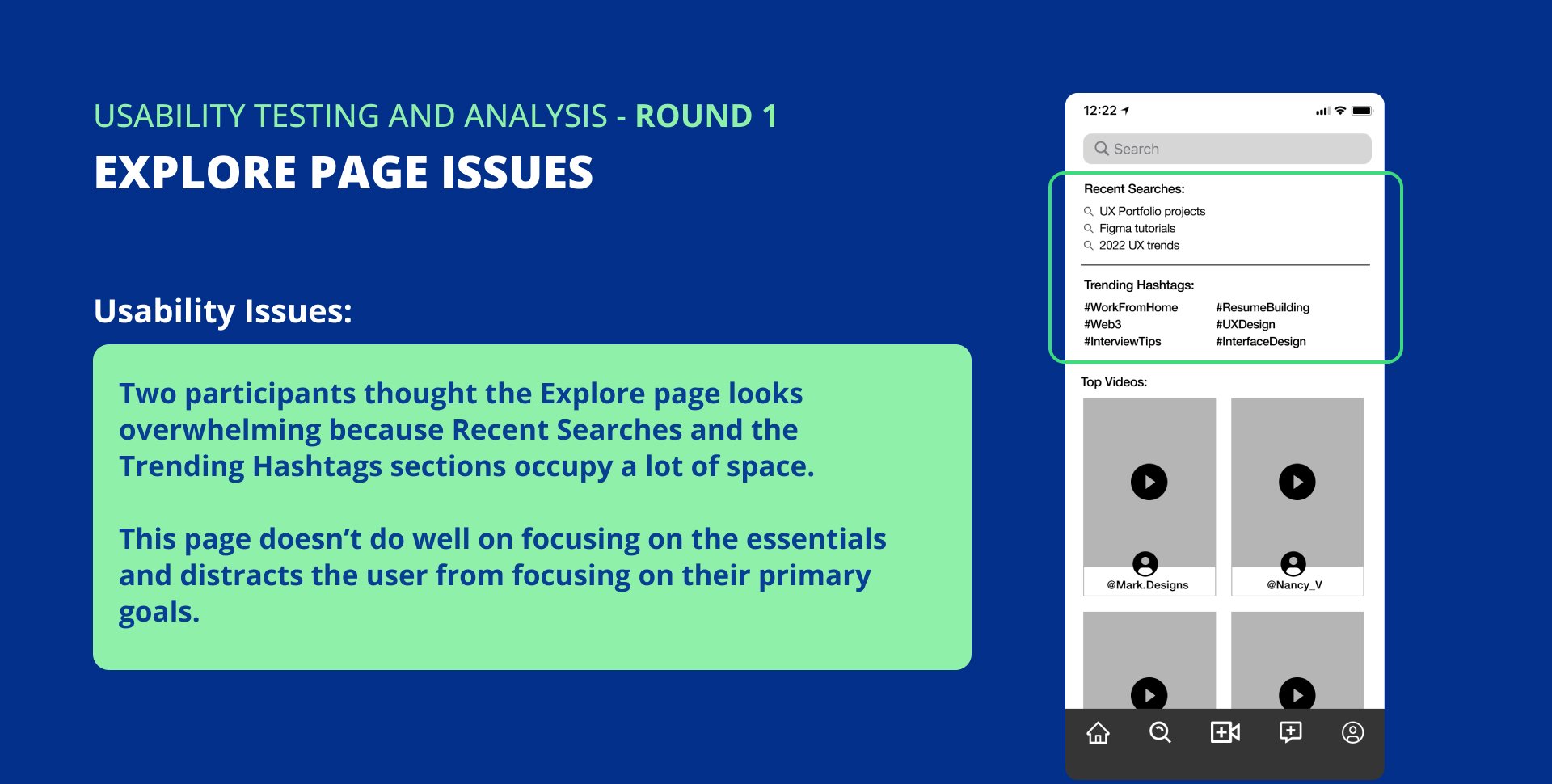
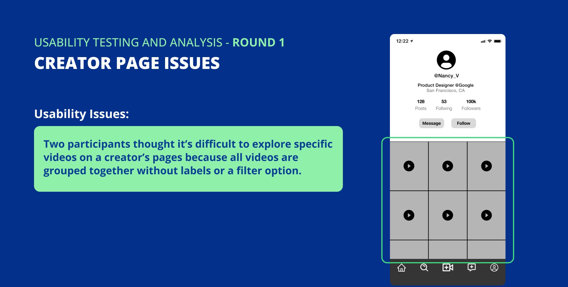
Usability testing takeaways
The main lesson learned from the usability testing is that even if participants finish a task, they may not be satisfied with the overall user experience. Although their suggestions are helpful in improving the interface, not everything can be implemented.

Prototype 1 updates
Steve Teeple (better known as Teeps) is a digital artist currently residing in the city of Los Angeles, CA where he dreams of vast 3D worlds and mind bending characters.
Round 2: Usability testing
This round’s goal is to assess how well the adjustments I made worked and see if there is anything else that needs to be addressed.
Observation: Including a video in this wireframe wasn’t required but it encouraged participants to talk about how some elements, such as video caption and icons, are not very visible.


Introducing a new feature to refocus on content creators
Presenting my idea to a senior UX designer @Google:
After talking to a senior UX designer from Google, I was convinced my app cannot compete effectively with TikTok and YouTube if the focus is only on videos. Why would content creators leave existing platforms to use Beam? I didn’t have a strong argument for that.
Why mentoring is hard:
He then walked me through some challenges he faced while trying to mentor people from LinkedIn. One of the challenges was people questioning his credibility because they haven’t seen his work. In addition, it was very time consuming to organize and schedule meetings with people.
Opportunity:
Beam is a video platform that showcases content creator’s personality and skills. It could have a video schedule feature to allow mentors to connect with their followers, earn money, and not worry less about the logistics.
Final prototype
You can view the final prototype HERE

Learning outcomes
Ask a lot of questions
“What problem will this new feature solve?”
“Is this the best way to solve this problem?”
“Why would people use my app?”
These are some questions I asked while working on this project to ensure I’m solving the user’s problem.
Quality over quantity
Successful new apps introduce a few features that go through several updates before carefully introducing more. I focused on the home and explore pages during the first and second usability testing because these had several issues. Once those issues were resolved, I added the schedule video call feature.
Look up competitors
The market is already saturated with apps and 90% of them fail within 30 days. It’s important to search competitors and understand how they deliver value to their consumers and what are their weaknesses.